2

I am trying to achieve a chart in Numbers 3.5 where both axis scale linearly.

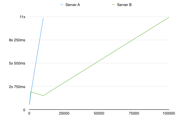
Right now, my chart looks like this: Chart
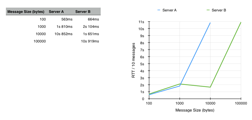
Obviously, I want the x-axis to scale because the 100.000 bytes message is MUCH larger than the 10.000 bytes message, and the current chart is misleading.

I can't find a way to do this - the x-axis is always labeled as a "Category" instead of a "Value". Any way to achieve this?

7
  • because your first coulomb is used as category, but you can switch that.
    – Ruskes
    Commented Jan 25, 2015 at 21:31
  • but how? I can't find a way to switch it.
    – BlackWolf
    Commented Jan 25, 2015 at 21:41
  • what should be your x-axis (category)?
    – Ruskes
    Commented Jan 25, 2015 at 22:02
  • the message size (as it is now), but it should scale linearly -- so I want the space between 10.000 and 100.000 to be 10x the space between 1.000 and 10.000
    – BlackWolf
    Commented Jan 25, 2015 at 23:03
  • that would be a logarithmic scale
    – Ruskes
    Commented Jan 25, 2015 at 23:16

1 Answer 1

3

Took me a while, but I figured it out: The solution is to choose a scatter plot instead of a line chart.

  1. Select Insert -> Chart -> 2D Scatter

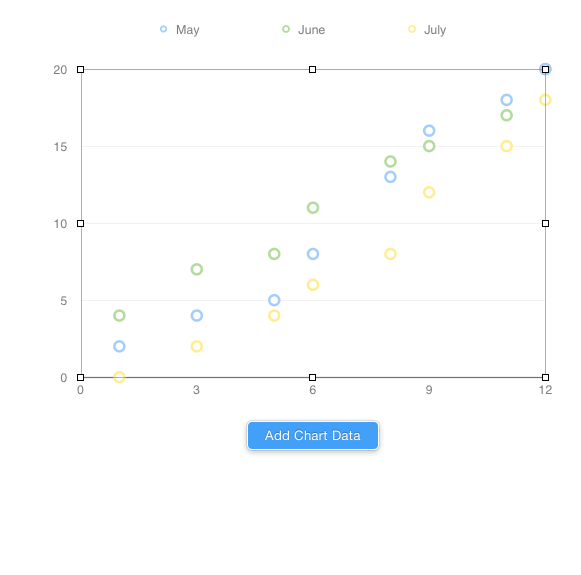
  2. Select the chart, then select Add Chart Data: enter image description here

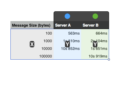
  3. Now simply select your entire table, including the x axis. Numbers will figure out the rest and automatically select your leftmost column as the x-axis. enter image description here

  4. Finally, to make it look like a line chart, select the chart, then select the "Axis" tab in the inspector Chose Data Symbols: None and Connection Lines: Straight.

Result:

enter image description here

You must log in to answer this question.

Not the answer you're looking for? Browse other questions tagged .