1

In the macOS UI there are several visual elements that seem to do the same thing. Why are they different? What is the meaning of each?

For example, all the clickable things shown below bring up a window that enables user to edit properties of the associated item. All the examples are from single section of System Settings.

"more than" character the "more than" character

"details..." button enter image description here

encircled "i" enter image description here

encircled ellipsis enter image description here

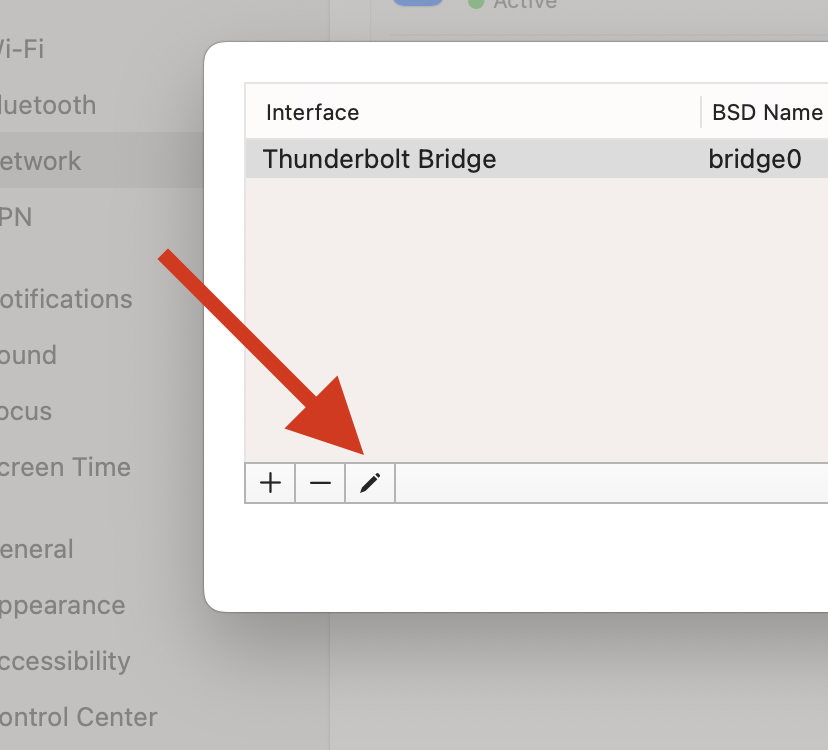
the pencil icon enter image description here

and, slightly different but same, the controls that appear on mouseover enter image description here

1
  • Re > vs ⓘ, the these are borrowing heavily from iOS/iPadOS and they are types of “disclosure indicators”: The former means “tap anywhere in this cell to navigate to the next view” and the latter ⓘ is “show me info w/ out ‘navigation’, but just present a view”. See developer.apple.com/design/human-interface-guidelines/…. The is “let me show you a pop-up menu of commands” and obviously the rest are just standard action buttons; these initiating some action, not navigation, not just more info.
    – Rob
    Commented May 10, 2023 at 5:11

1 Answer 1

6

It’s not clear where the confusion is coming from. These are pretty much industry standard UI elements. I’ll attempt to address each one in the order you listed:

Triangle Icon

The “greater than symbol” indicates there are additional sub-menus in the settings pane. It’s actually called a “triangle icon”

Each column represents one level of the hierarchy and contains horizontal rows of data items. Within a column, any parent item that contains nested child items is marked with a triangle icon.

The Info Button

The encircled “i” is synonymous with the “Details…” button. Notice the ellipsis (three dots). In this case, it means “Info.” More details can be found in your previous question.. It is also in the same category as the “Help” button (Circle with a question mark inside). With these buttons, there is no additional user input. It will display a pane of details (like IP address, router, DNS server, etc. for a network item) or help info related to the current pane if it’s a help button.

The Gradient Icon

The pencil icon is synonymous with “Edit.” It is one of the Gradient Buttons. This is where you can initiate an action in relation to particular pane

A gradient button initiates an action related to a view, like adding or removing rows in a table.
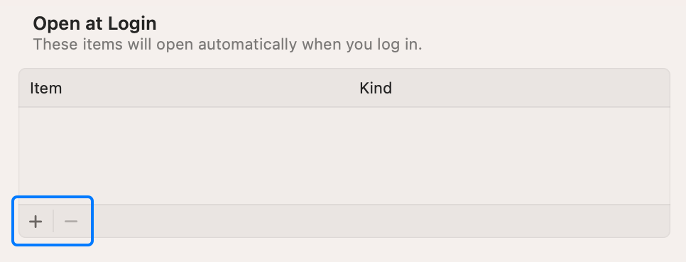
Gradient Button Image

Action Button

The “connect” button is an action button. Clicking it will perform that action; in this case, connect to that particular network. No other user input is required.

Ensure that each button clearly communicates it purpose. A button always includes a text label or a symbol (or interface icon) — and sometimes a combination of both — to help people predict what it does.
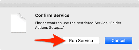
Action Button Example

Inevitable Inconsistencies

The developers of macOS take great pains in ensuring consistency with their UI. Even so, there’s going to be some inconsistencies especially when they begin to integrate mobile and desktop apps as universal binaries.

You will find, as you point out, there are inconsistent usages. That s going to happen with an OS as large snd complex as macOS; it is in a constant state of development and improvement. Elements are being sourced from one platform to another, iOS to macOS for example. The explanations I’ve provided should provide some guidance in interpreting them.

5
  • 1
    Confusion comes from different ui elements doing the same thing. Or in other words from 5 different industry standards used in the same app all at once. I think I feel greater pain from ths UI than its designers took in ensuring consistency. There must be some rational explanation that would aliviate the suffering. Please, GOD, let there be some genious, or at least sane, reason for this that evades me. Commented May 7, 2023 at 22:01
  • I think only the Details and the i icon do the same thing all the others are different - in some apps they might allow editing but that is not true in all cases.
    – mmmmmm
    Commented May 7, 2023 at 22:12
  • While I can see the argument that they all do basically the same thing (show more info and in some cases allow you to make changes) the answer that @Allan provided shows that the differences between these UI elements are, shall we say, subtle. You might think that the differences are splitting hairs but they are, none the less, differences. Commented May 8, 2023 at 13:49
  • Details vs. i icon is due to migrating from the MacOS "big screen" design to the small icons of mobile devices. Apple has been making things more consistent between the two UIs.
    – Barmar
    Commented May 8, 2023 at 14:21
  • Just wanted to note that the encircled "I" in some cases does indeed open dialog windows with additional user input, for example in the "VPN" preference pane.
    – dorian
    Commented May 8, 2023 at 14:29

Not the answer you're looking for? Browse other questions tagged .