fixed keyboard input symbols, removed mistaken italics
Source Link
Fii
  • 21
  • 4

Multi-Column Layout in Pages: Use Tables

I don't know why paragraph spacing doesn't apply properly between one and multi-column sections but there is a better alternative: tables.

This is suggested in Apple's official Format columns guide – not explicitly intended to solve this issue, but it is also considered a 'legit' way to have multi-column text, and it does preserve correct paragraph spacing:

Note: If you don’t want the content in columns to flow from one column to the next, add a table with the number of columns you want to your document instead. That way, you can enter text across the page in individual table cells.

From this description you can see the one drawback – text will not flow across columns automatically, you will have to enter text in a new column manually. This isn't a big issue for small sections of text as you can quickly rearrange if needed, and if you wanted very long double-column sections, they should probably be on their own page anyway.

Ask yourself why you need multiple columns

The multi-column layout option is intended for long, main body text, as is a single column. Therefore, a multi-column layout should mainly be used for the main body.

So, if you intended to only have a small section of multi-column text, embedded within the main body, this is more akin to a table object. This may be good for lists, or e.g. a poster, information brochure, etc. with a block-like layout, switching between different column numbers (you can also use merge-columns columns for a similar effect).

In your case, you have some lists, which need to be aligned correctly – when you need nicely aligned text, tables are usually the way to go (I'm a LaTeX user, so I am forever painfully aware of text layout & spacing). Furthermore, it looks like you have used two columns in your example, but it would benefit more from the use of four columns – the volunteering dates are not aligned properly.

Make sure the table is formatted correctly

  • No fill
  • No text inset (correct paragraph indentation)
  • Disable outlines/gridlines/borders
  • Disable headers, footers, titles, row colours
  • Resize rows to fill cell contents (auto-size)
  • Text wrap: inline with text (for paragraph spacing)
  • Resize the table to snap flush with margin guides

Also, make sure the table begins on a new paragraph (¶). I recommend using Shift+Cmd+ I to++I to view invisibles (spaces and breaks), to see howhow your text is actually structured.

Example

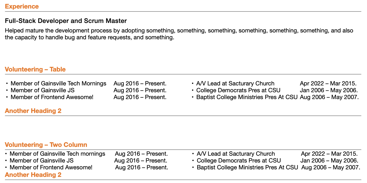
Based on the original question, this shows the difference between a 4×1 (col×row) table and a 2-column section. See how before and after the table, the Heading 2 spacing is retained, whereas it is not with the 2-column section.

Multi-Column Formatting

Here is the same thing, but with invisibles shown for clarity. See how you have to add lots of spaces (or tab stops) to get the dates (somewhat) aligned. This is very delicate, as any change to the font or text will mess up the alignment. Using 4 columns in the table, however, each block of text can easily be justified as you see fit, without all the unnecessary invisible characters.

Multi-Column Formatting (With Invisibles)

Multi-Column Layout in Pages: Use Tables

I don't know why paragraph spacing doesn't apply properly between one and multi-column sections but there is a better alternative: tables.

This is suggested in Apple's official Format columns guide – not explicitly intended to solve this issue, but it is also considered a 'legit' way to have multi-column text, and it does preserve correct paragraph spacing:

Note: If you don’t want the content in columns to flow from one column to the next, add a table with the number of columns you want to your document instead. That way, you can enter text across the page in individual table cells.

From this description you can see the one drawback – text will not flow across columns automatically, you will have to enter text in a new column manually. This isn't a big issue for small sections of text as you can quickly rearrange if needed, and if you wanted very long double-column sections, they should probably be on their own page anyway.

Ask yourself why you need multiple columns

The multi-column layout option is intended for long, main body text, as is a single column. Therefore, a multi-column layout should mainly be used for the main body.

So, if you intended to only have a small section of multi-column text, embedded within the main body, this is more akin to a table object. This may be good for lists, or e.g. a poster, information brochure, etc. with a block-like layout, switching between different column numbers (you can also use merge-columns columns for a similar effect).

In your case, you have some lists, which need to be aligned correctly – when you need nicely aligned text, tables are usually the way to go (I'm a LaTeX user, so I am forever painfully aware of text layout & spacing). Furthermore, it looks like you have used two columns in your example, but it would benefit more from the use of four columns – the volunteering dates are not aligned properly.

Make sure the table is formatted correctly

  • No fill
  • No text inset (correct paragraph indentation)
  • Disable outlines/gridlines/borders
  • Disable headers, footers, titles, row colours
  • Resize rows to fill cell contents (auto-size)
  • Text wrap: inline with text (for paragraph spacing)
  • Resize the table to snap flush with margin guides

Also, make sure the table begins on a new paragraph (¶). I recommend using Shift+Cmd+ I to view invisibles (spaces and breaks), to see how your text is actually structured.

Example

Based on the original question, this shows the difference between a 4×1 (col×row) table and a 2-column section. See how before and after the table, the Heading 2 spacing is retained, whereas it is not with the 2-column section.

Multi-Column Formatting

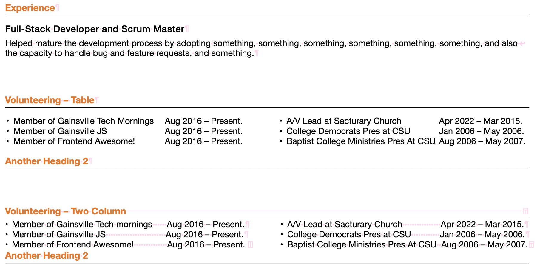
Here is the same thing, but with invisibles shown for clarity. See how you have to add lots of spaces (or tab stops) to get the dates (somewhat) aligned. This is very delicate, as any change to the font or text will mess up the alignment. Using 4 columns in the table, however, each block of text can easily be justified as you see fit, without all the unnecessary invisible characters.
Multi-Column Formatting (With Invisibles)

Multi-Column Layout in Pages: Use Tables

I don't know why paragraph spacing doesn't apply properly between one and multi-column sections but there is a better alternative: tables.

This is suggested in Apple's official Format columns guide – not explicitly intended to solve this issue, but it is also considered a 'legit' way to have multi-column text, and it does preserve correct paragraph spacing:

Note: If you don’t want the content in columns to flow from one column to the next, add a table with the number of columns you want to your document instead. That way, you can enter text across the page in individual table cells.

From this description you can see the one drawback – text will not flow across columns automatically, you will have to enter text in a new column manually. This isn't a big issue for small sections of text as you can quickly rearrange if needed, and if you wanted very long double-column sections, they should probably be on their own page anyway.

Ask yourself why you need multiple columns

The multi-column layout option is intended for long, main body text, as is a single column. Therefore, a multi-column layout should mainly be used for the main body.

So, if you intended to only have a small section of multi-column text, embedded within the main body, this is more akin to a table object. This may be good for lists, or e.g. a poster, information brochure, etc. with a block-like layout, switching between different column numbers (you can also use merge-columns columns for a similar effect).

In your case, you have some lists, which need to be aligned correctly – when you need nicely aligned text, tables are usually the way to go (I'm a LaTeX user, so I am forever painfully aware of text layout & spacing). Furthermore, it looks like you have used two columns in your example, but it would benefit more from the use of four columns – the volunteering dates are not aligned properly.

Make sure the table is formatted correctly

  • No fill
  • No text inset (correct paragraph indentation)
  • Disable outlines/gridlines/borders
  • Disable headers, footers, titles, row colours
  • Resize rows to fill cell contents (auto-size)
  • Text wrap: inline with text (for paragraph spacing)
  • Resize the table to snap flush with margin guides

Also, make sure the table begins on a new paragraph (¶). I recommend using ++I to view invisibles (spaces and breaks), to see how your text is actually structured.

Example

Based on the original question, this shows the difference between a 4×1 (col×row) table and a 2-column section. See how before and after the table, the Heading 2 spacing is retained, whereas it is not with the 2-column section.

Multi-Column Formatting

Here is the same thing, but with invisibles shown for clarity. See how you have to add lots of spaces (or tab stops) to get the dates (somewhat) aligned. This is very delicate, as any change to the font or text will mess up the alignment. Using 4 columns in the table, however, each block of text can easily be justified as you see fit, without all the unnecessary invisible characters.

Multi-Column Formatting (With Invisibles)

fixed grammar, punctuation, formatting
Source Link
agarza
  • 2.4k
  • 8
  • 16
  • 27

Multi-Column Layout in Pages: Use Tables

I don't know why paragraph spacing doesn't apply properly between one and multi-column sections but there is a better alternative: tables.

This is suggested in Apple's official Format columns guide – not explicitly intended to solve this issue, but it is also considered a 'legit' way to have multi-column text, and it does preserve correct paragraph spacing:

Note: If you don’t want the content in columns to flow from one column to the next, add a table with the number of columns you want to your document instead. That way, you can enter text across the page in individual table cells.

From this description you can see the one drawback – text will not flow across columns automatically, you will have to enter text in a new column manually. This isn't a big issue for small sections of text as you can quickly rearrange if needed, and if you wanted very long double column-column sections, they should probably be on their own page anyway.

Ask yourself why you need multiple columns

The multi-column layout option is intended for long, main body text, as is a single column. Therefore, a multi-column layout should mainly be used for the main body.

So, if you intended to only have a small section of multi-column text, embedded within the main body, this is more akin to a table object. This may be good for lists, or e.g. a poster, information brochure, etc. with a block-like layout, switching between different column numbers (you can also use merge-columns columns for a similar effect).

In your case, you have some lists, which need to be aligned correctly – when you need nicely aligned text, tables are usually the way to go (I'm a LaTeX user, so I am forever painfully aware of text layout & spacing). Furthermore, it it looks like you have used two-columns columns in your example, but it would benefit more from the use of four columns – the volunteering dates are not aligned properly.

Make sure the table is formatted correctly

  • No fill
  • No text inset (correct paragraph indentation)
  • Disable outlines/gridlines/borders
  • Disable headers, footers, titles, row colours
  • Resize rows to fill cell contents (auto-size)
  • Text wrap: inline with text (for paragraph spacing)
  • Resize the table to snap flush with margin guides

Also, make sure the table begins on a new paragraph (¶). I recommend using shift+cmd+i toShift+Cmd+ I to view invisibles (spaces and breaks), to see howhow your text is actually structured.

Example

Based on the orginaloriginal question, this shows the difference between a 4×1 (col×row) table, and a 2 column-column section. See how before and after the table, the Heading 2 spacing is retained, whereas it is not with the 2 column-column section.

Multi-Column Formatting

Here is the same thing, but with invisibles shown for clarity. See how you have to add lots of spaces (or tab stops) to get the dates (somewhat) aligned. This is very delicate, as any change to the font or the text will mess up the alignment. Using 4 columns in the table, however, each block of text can easily be justified as you see fit, without all the unnecessary invisible characters.

Multi-Column Formatting (With Invisibles)

Multi-Column Layout in Pages: Use Tables

I don't know why paragraph spacing doesn't apply properly between one and multi-column sections but there is a better alternative: tables.

This is suggested in Apple's official Format columns guide – not explicitly intended to solve this issue, but it is also considered a 'legit' way to have multi-column text, and it does preserve correct paragraph spacing:

Note: If you don’t want the content in columns to flow from one column to the next, add a table with the number of columns you want to your document instead. That way, you can enter text across the page in individual table cells.

From this description you can see the one drawback – text will not flow across columns automatically, you will have to enter text in a new column manually. This isn't a big issue for small sections of text as you can quickly rearrange if needed, and if you wanted very long double column sections, they should probably be on their own page anyway.

Ask yourself why you need multiple columns

The multi-column layout option is intended for long, main body text, as is single column. Therefore, multi-column layout should mainly be used for the main body.

So, if you intended to only have a small section of multi-column text, embedded within the main body, this is more akin to a table object. This may be good for lists, or e.g. a poster, information brochure etc. with a block-like layout, switching between different column numbers (you can also use merge-columns columns for a similar effect).

In your case, you have some lists, which need to be aligned correctly – when you need nicely aligned text, tables are usually the way to go (I'm a LaTeX user, so I am forever painfully aware of text layout & spacing). Furthermore, it it looks like you have used two-columns in your example, but it would benefit more from the use of four columns – the volunteering dates are not aligned properly.

Make sure the table is formatted correctly

  • No fill
  • No text inset (correct paragraph indentation)
  • Disable outlines/gridlines/borders
  • Disable headers, footers, titles, row colours
  • Resize rows to fill cell contents (auto-size)
  • Text wrap: inline with text (for paragraph spacing)
  • Resize the table to snap flush with margin guides

Also make sure the table begins on a new paragraph (¶). I recommend using shift+cmd+i to view invisibles (spaces and breaks), to see how your text is actually structured.

Example

Based on the orginal question, this shows the difference between a 4×1 (col×row) table, and a 2 column section. See how before and after the table, the Heading 2 spacing is retained, whereas it is not with the 2 column section.

Multi-Column Formatting

Here is the same thing, but with invisibles shown for clarity. See how you have to add lots of spaces (or tab stops) to get the dates (somewhat) aligned. This is very delicate, as any change to font or the text will mess up the alignment. Using 4 columns in the table however, each block of text can easily be justified as you see fit, without all the unnecessary invisible characters.

Multi-Column Formatting (With Invisibles)

Multi-Column Layout in Pages: Use Tables

I don't know why paragraph spacing doesn't apply properly between one and multi-column sections but there is a better alternative: tables.

This is suggested in Apple's official Format columns guide – not explicitly intended to solve this issue, but it is also considered a 'legit' way to have multi-column text, and it does preserve correct paragraph spacing:

Note: If you don’t want the content in columns to flow from one column to the next, add a table with the number of columns you want to your document instead. That way, you can enter text across the page in individual table cells.

From this description you can see the one drawback – text will not flow across columns automatically, you will have to enter text in a new column manually. This isn't a big issue for small sections of text as you can quickly rearrange if needed, and if you wanted very long double-column sections, they should probably be on their own page anyway.

Ask yourself why you need multiple columns

The multi-column layout option is intended for long, main body text, as is a single column. Therefore, a multi-column layout should mainly be used for the main body.

So, if you intended to only have a small section of multi-column text, embedded within the main body, this is more akin to a table object. This may be good for lists, or e.g. a poster, information brochure, etc. with a block-like layout, switching between different column numbers (you can also use merge-columns columns for a similar effect).

In your case, you have some lists, which need to be aligned correctly – when you need nicely aligned text, tables are usually the way to go (I'm a LaTeX user, so I am forever painfully aware of text layout & spacing). Furthermore, it looks like you have used two columns in your example, but it would benefit more from the use of four columns – the volunteering dates are not aligned properly.

Make sure the table is formatted correctly

  • No fill
  • No text inset (correct paragraph indentation)
  • Disable outlines/gridlines/borders
  • Disable headers, footers, titles, row colours
  • Resize rows to fill cell contents (auto-size)
  • Text wrap: inline with text (for paragraph spacing)
  • Resize the table to snap flush with margin guides

Also, make sure the table begins on a new paragraph (¶). I recommend using Shift+Cmd+ I to view invisibles (spaces and breaks), to see how your text is actually structured.

Example

Based on the original question, this shows the difference between a 4×1 (col×row) table and a 2-column section. See how before and after the table, the Heading 2 spacing is retained, whereas it is not with the 2-column section.

Multi-Column Formatting

Here is the same thing, but with invisibles shown for clarity. See how you have to add lots of spaces (or tab stops) to get the dates (somewhat) aligned. This is very delicate, as any change to the font or text will mess up the alignment. Using 4 columns in the table, however, each block of text can easily be justified as you see fit, without all the unnecessary invisible characters.

Multi-Column Formatting (With Invisibles)

clearer heading - easier to search for and summarises key point in answer
Source Link
Fii
  • 21
  • 4

Multi-Column Layout in Pages: Use Tables

I don't know why paragraph spacing doesn't apply properly between one and multi-column sections but there is a better alternative: tables.

This is suggested in Apple's official Format columns guide – not explicitly intended to solve this issue, but it is also considered a 'legit' way to have multi-column text, and it does preserve correct paragraph spacing:

Note: If you don’t want the content in columns to flow from one column to the next, add a table with the number of columns you want to your document instead. That way, you can enter text across the page in individual table cells.

From this description you can see the one drawback – text will not flow across columns automatically, you will have to enter text in a new column manually. This isn't a big issue for small sections of text as you can quickly rearrange if needed, and if you wanted very long double column sections, they should probably be on their own page anyway.

Ask yourself why you need multiple columns

The multi-column layout option is intended for long, main body text, as is single column. Therefore, multi-column layout should mainly be used for the main body.

So, if you intended to only have a small section of multi-column text, embedded within the main body, this is more akin to a table object. This may be good for lists, or e.g. a poster, information brochure etc. with a block-like layout, switching between different column numbers (you can also use merge-columns columns for a similar effect).

In your case, you have some lists, which need to be aligned correctly – when you need nicely aligned text, tables are usually the way to go (I'm a LaTeX user, so I am forever painfully aware of text layout & spacing). Furthermore, it it looks like you have used two-columns in your example, but it would benefit more from the use of four columns – the volunteering dates are not aligned properly.

Make sure the table is formatted correctly

  • No fill
  • No text inset (correct paragraph indentation)
  • Disable outlines/gridlines/borders
  • Disable headers, footers, titles, row colours
  • Resize rows to fill cell contents (auto-size)
  • Text wrap: inline with text (for paragraph spacing)
  • Resize the table to snap flush with margin guides

Also make sure the table begins on a new paragraph (¶). I recommend using shift+cmd+i to view invisibles (spaces and breaks), to see how your text is actually structured.

Example

Based on the orginal question, this shows the difference between a 4×1 (col×row) table, and a 2 column section. See how before and after the table, the Heading 2 spacing is retained, whereas it is not with the 2 column section.

Multi-Column Formatting

Here is the same thing, but with invisibles shown for clarity. See how you have to add lots of spaces (or tab stops) to get the dates (somewhat) aligned. This is very delicate, as any change to font or the text will mess up the alignment. Using 4 columns in the table however, each block of text can easily be justified as you see fit, without all the unnecessary invisible characters.

Multi-Column Formatting (With Invisibles)

Multi-Column Layout in Pages

I don't know why paragraph spacing doesn't apply properly between one and multi-column sections but there is a better alternative: tables.

This is suggested in Apple's official Format columns guide – not explicitly intended to solve this issue, but it is also considered a 'legit' way to have multi-column text, and it does preserve correct paragraph spacing:

Note: If you don’t want the content in columns to flow from one column to the next, add a table with the number of columns you want to your document instead. That way, you can enter text across the page in individual table cells.

From this description you can see the one drawback – text will not flow across columns automatically, you will have to enter text in a new column manually. This isn't a big issue for small sections of text as you can quickly rearrange if needed, and if you wanted very long double column sections, they should probably be on their own page anyway.

Ask yourself why you need multiple columns

The multi-column layout option is intended for long, main body text, as is single column. Therefore, multi-column layout should mainly be used for the main body.

So, if you intended to only have a small section of multi-column text, embedded within the main body, this is more akin to a table object. This may be good for lists, or e.g. a poster, information brochure etc. with a block-like layout, switching between different column numbers (you can also use merge-columns columns for a similar effect).

In your case, you have some lists, which need to be aligned correctly – when you need nicely aligned text, tables are usually the way to go (I'm a LaTeX user, so I am forever painfully aware of text layout & spacing). Furthermore, it it looks like you have used two-columns in your example, but it would benefit more from the use of four columns – the volunteering dates are not aligned properly.

Make sure the table is formatted correctly

  • No fill
  • No text inset (correct paragraph indentation)
  • Disable outlines/gridlines/borders
  • Disable headers, footers, titles, row colours
  • Resize rows to fill cell contents (auto-size)
  • Text wrap: inline with text (for paragraph spacing)
  • Resize the table to snap flush with margin guides

Also make sure the table begins on a new paragraph (¶). I recommend using shift+cmd+i to view invisibles (spaces and breaks), to see how your text is actually structured.

Example

Based on the orginal question, this shows the difference between a 4×1 (col×row) table, and a 2 column section. See how before and after the table, the Heading 2 spacing is retained, whereas it is not with the 2 column section.

Multi-Column Formatting

Here is the same thing, but with invisibles shown for clarity. See how you have to add lots of spaces (or tab stops) to get the dates (somewhat) aligned. This is very delicate, as any change to font or the text will mess up the alignment. Using 4 columns in the table however, each block of text can easily be justified as you see fit, without all the unnecessary invisible characters.

Multi-Column Formatting (With Invisibles)

Multi-Column Layout in Pages: Use Tables

I don't know why paragraph spacing doesn't apply properly between one and multi-column sections but there is a better alternative: tables.

This is suggested in Apple's official Format columns guide – not explicitly intended to solve this issue, but it is also considered a 'legit' way to have multi-column text, and it does preserve correct paragraph spacing:

Note: If you don’t want the content in columns to flow from one column to the next, add a table with the number of columns you want to your document instead. That way, you can enter text across the page in individual table cells.

From this description you can see the one drawback – text will not flow across columns automatically, you will have to enter text in a new column manually. This isn't a big issue for small sections of text as you can quickly rearrange if needed, and if you wanted very long double column sections, they should probably be on their own page anyway.

Ask yourself why you need multiple columns

The multi-column layout option is intended for long, main body text, as is single column. Therefore, multi-column layout should mainly be used for the main body.

So, if you intended to only have a small section of multi-column text, embedded within the main body, this is more akin to a table object. This may be good for lists, or e.g. a poster, information brochure etc. with a block-like layout, switching between different column numbers (you can also use merge-columns columns for a similar effect).

In your case, you have some lists, which need to be aligned correctly – when you need nicely aligned text, tables are usually the way to go (I'm a LaTeX user, so I am forever painfully aware of text layout & spacing). Furthermore, it it looks like you have used two-columns in your example, but it would benefit more from the use of four columns – the volunteering dates are not aligned properly.

Make sure the table is formatted correctly

  • No fill
  • No text inset (correct paragraph indentation)
  • Disable outlines/gridlines/borders
  • Disable headers, footers, titles, row colours
  • Resize rows to fill cell contents (auto-size)
  • Text wrap: inline with text (for paragraph spacing)
  • Resize the table to snap flush with margin guides

Also make sure the table begins on a new paragraph (¶). I recommend using shift+cmd+i to view invisibles (spaces and breaks), to see how your text is actually structured.

Example

Based on the orginal question, this shows the difference between a 4×1 (col×row) table, and a 2 column section. See how before and after the table, the Heading 2 spacing is retained, whereas it is not with the 2 column section.

Multi-Column Formatting

Here is the same thing, but with invisibles shown for clarity. See how you have to add lots of spaces (or tab stops) to get the dates (somewhat) aligned. This is very delicate, as any change to font or the text will mess up the alignment. Using 4 columns in the table however, each block of text can easily be justified as you see fit, without all the unnecessary invisible characters.

Multi-Column Formatting (With Invisibles)

add an extra formatting tip
Source Link
Fii
  • 21
  • 4
Loading
Source Link
Fii
  • 21
  • 4
Loading